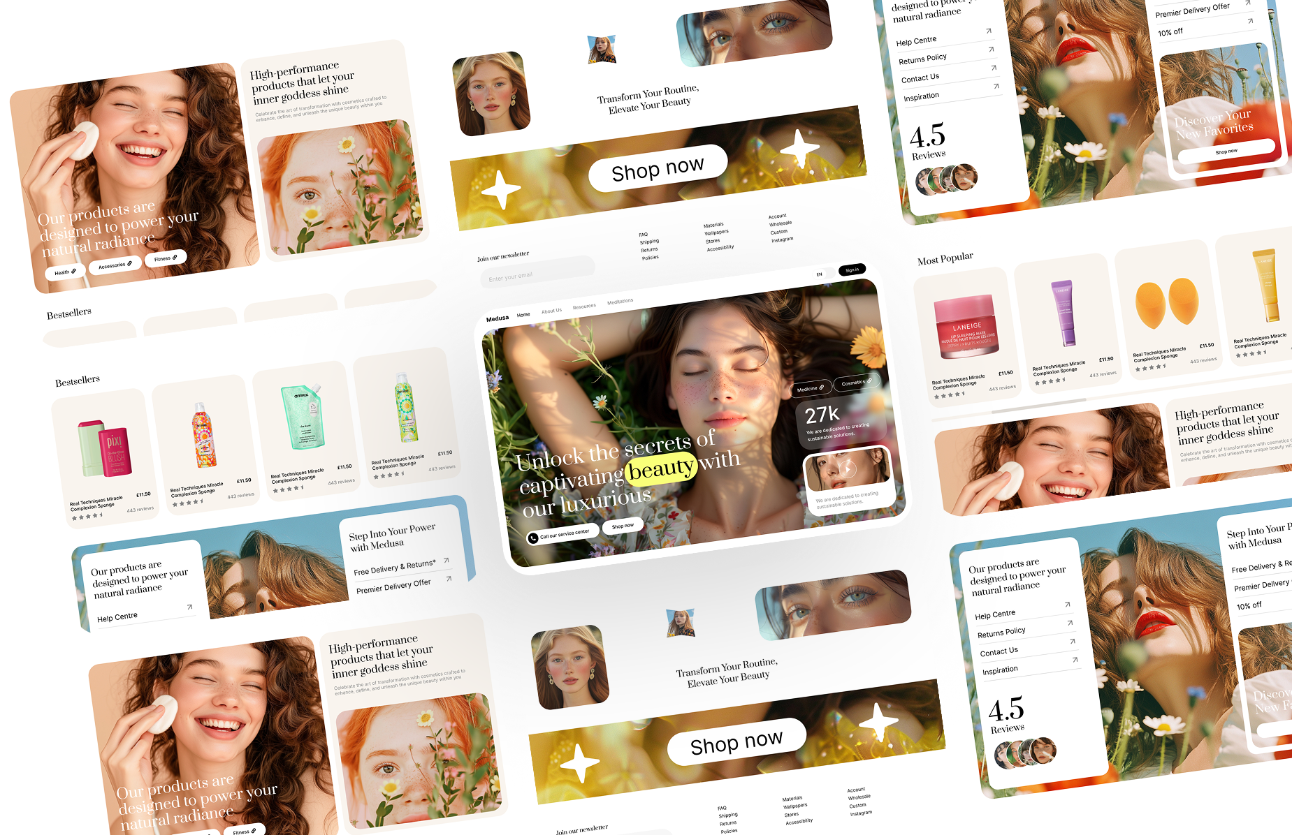
A centred hero with a status pill, an oversized two-tone headline and two buttons on a faint grid background. React and Tailwind CSS.
HeroCenter.tsx
// Centred hero: status pill, oversized two-tone headline, two buttons on a faint grid.
// Pure Tailwind, no dependencies. Works with Tailwind v3 and v4.

type Props = {
  badge?: string;
  heading?: [string, string];
  intro?: string;
  primary?: { label: string; href: string };
  secondary?: { label: string; href: string };
  note?: string;
};

export default function HeroCenter({
  badge = "Now in public beta",
  heading = ["Build faster.", "Ship smarter."],
  intro = "The design system for teams who charge premium rates and deliver premium results.",
  primary = { label: "Start for free →", href: "#" },
  secondary = { label: "View templates", href: "#" },
  note = "No credit card required · Cancel anytime",
}: Props) {
  return (
    <section className="relative flex min-h-screen flex-col items-center justify-center overflow-hidden bg-white px-6 font-sans antialiased">
      {/* Grid background */}
      <div
        aria-hidden
        className="absolute inset-0 opacity-[0.05]"
        style={{
          backgroundImage: "linear-gradient(#000 1px, transparent 1px), linear-gradient(90deg, #000 1px, transparent 1px)",
          backgroundSize: "60px 60px",
        }}
      />
      {/* Glow */}
      <div aria-hidden className="pointer-events-none absolute left-1/2 top-1/2 h-[480px] w-[480px] -translate-x-1/2 -translate-y-1/2 rounded-full bg-lime-200/60 blur-[120px]" />

      <div className="relative z-10 mx-auto max-w-5xl text-center">
        <div className="mb-8 inline-flex items-center gap-2 rounded-full border border-black/10 bg-white px-4 py-1.5">
          <span className="h-1.5 w-1.5 rounded-full bg-lime-500" />
          <span className="font-mono text-xs uppercase tracking-widest text-black/60">{badge}</span>
        </div>

        <h1 className="mb-8 text-[clamp(48px,8vw,120px)] font-black leading-[0.9] tracking-[-0.04em] text-black">
          {heading[0]}
          <br />
          <span className="text-lime-500">{heading[1]}</span>
        </h1>

        <p className="mx-auto mb-12 max-w-xl text-[clamp(15px,2vw,20px)] font-light leading-relaxed text-black/50">{intro}</p>

        <div className="flex flex-col justify-center gap-3 sm:flex-row">
          <a href={primary.href} className="rounded-full bg-lime-400 px-8 py-4 text-sm font-bold uppercase tracking-wider text-black transition-colors duration-200 hover:bg-lime-500">
            {primary.label}
          </a>
          <a href={secondary.href} className="rounded-full border border-black/10 px-8 py-4 text-sm uppercase tracking-wider text-black/60 transition-all duration-200 hover:border-black/30 hover:text-black">
            {secondary.label}
          </a>
        </div>

        <p className="mt-8 font-mono text-xs text-black/30">{note}</p>
      </div>

      <div aria-hidden className="pointer-events-none absolute bottom-0 left-0 right-0 h-40 bg-gradient-to-t from-white to-transparent" />
    </section>
  );
}
How to use it
- Make sure your Next.js or React project has Tailwind CSS set up (v3 or v4 both work).
- Create
components/HeroCenter.tsxand paste the code. - Import it into a page and replace the sample text and images with your own.
More hero sections
View all
Launch a full site instead
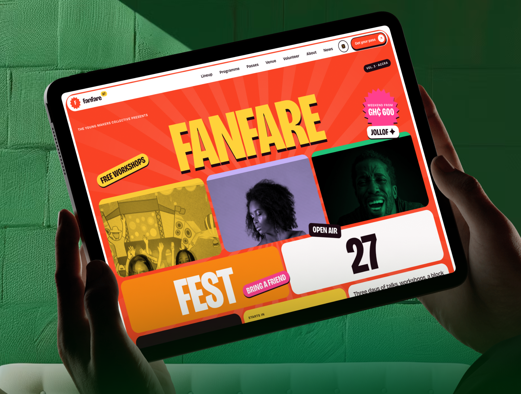 Next.js + Astro
All-Access PREMIUM NEXTJS ASTRO
Fanfare - Festival & Event Website TemplateFanfare is a colourful festival and event website template: poster hero, flip-card lineup, programme...
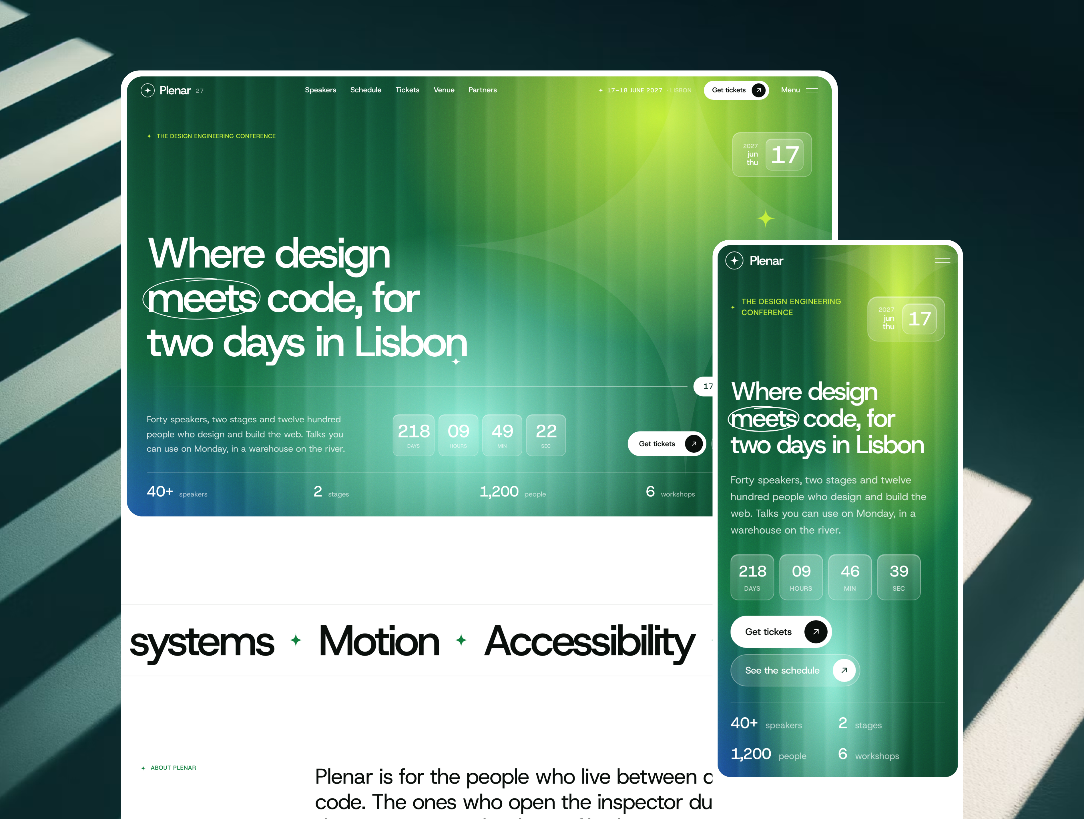 Next.js + Astro
All-Access NEXTJS ASTRO PREMIUM
Plenar - Conference & Event Website TemplatePlenar is a premium conference and event website template: countdown hero, speakers, schedule with s...
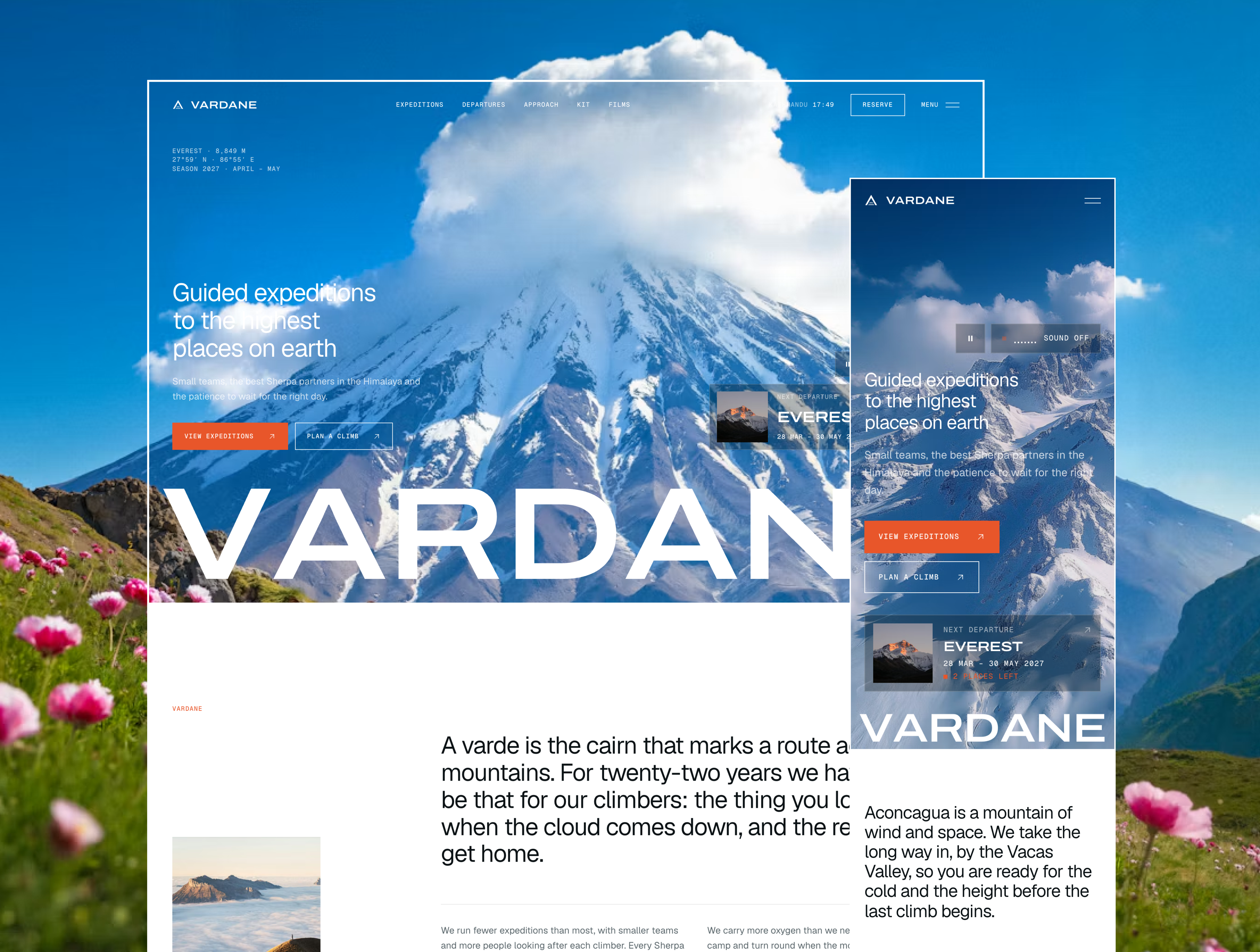 Next.js + Astro
All-Access NEXTJS ASTRO PREMIUM
Vardane - Luxury Expedition & Mountaineering Website TemplateVardane is a premium website template for mountaineering and expedition companies: film hero, route ...