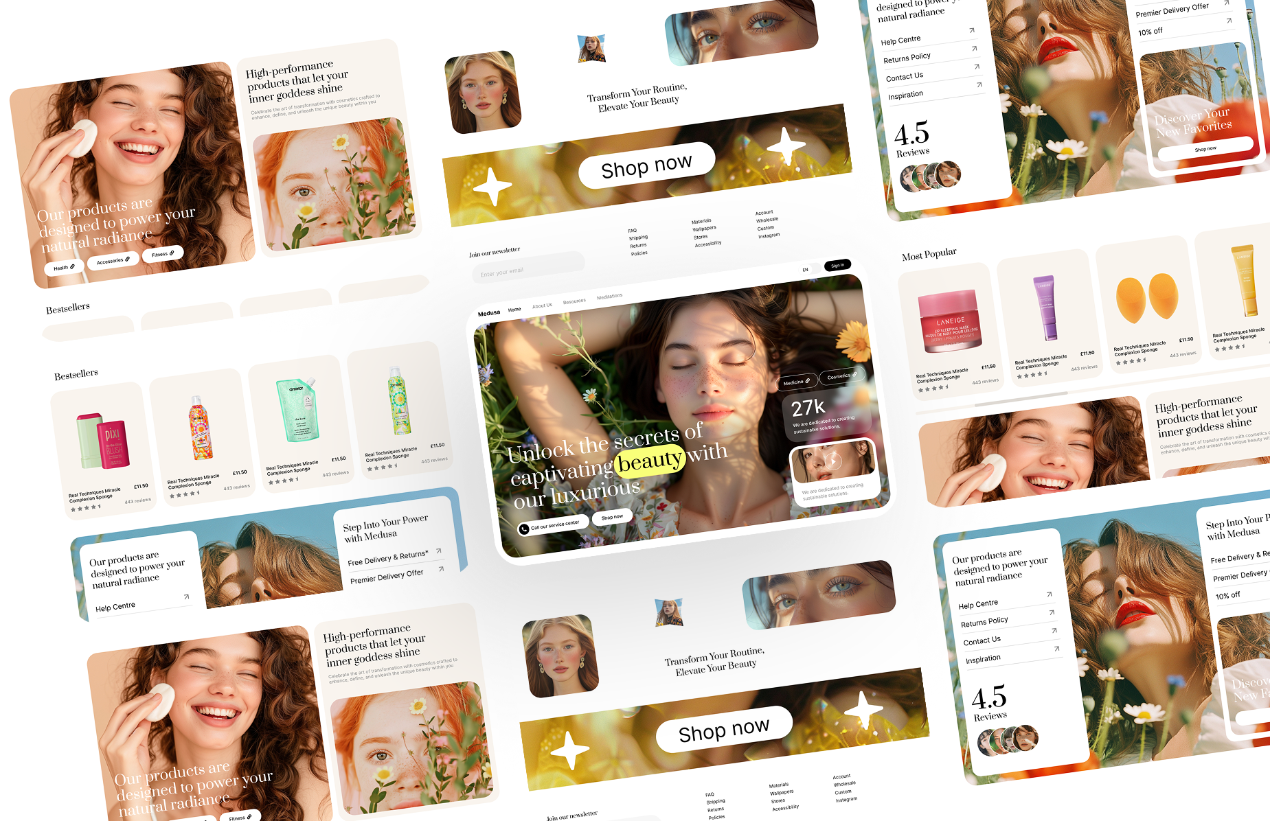
A dark sticky navbar with centred links, sign-in, a lime pill button and an animated mobile menu. React and Tailwind CSS.
NavbarDark.tsx
"use client";

// Dark sticky navbar: logo, centred links, sign-in and a lime pill button,
// with an animated hamburger and dropdown menu on phones.
// Pure Tailwind + React, no dependencies. Works with Tailwind v3 and v4.

import { useState } from "react";

type Link = { label: string; href: string };

type Props = {
  logo?: string;
  links?: Link[];
  signIn?: Link;
  cta?: Link;
};

const DEFAULT_LINKS: Link[] = [
  { label: "Product", href: "#" },
  { label: "Solutions", href: "#" },
  { label: "Pricing", href: "#" },
  { label: "Docs", href: "#" },
];

export default function NavbarDark({
  logo = "Lumen",
  links = DEFAULT_LINKS,
  signIn = { label: "Sign in", href: "#" },
  cta = { label: "Get started", href: "#" },
}: Props) {
  const [open, setOpen] = useState(false);

  return (
    <header className="sticky top-0 z-50 w-full border-b border-white/10 bg-black font-sans antialiased">
      <div className="mx-auto flex h-16 max-w-7xl items-center justify-between px-5 md:px-8">
        <a href="#" className="font-serif text-2xl font-bold uppercase tracking-[0.08em] text-white">
          {logo}
        </a>

        <nav className="hidden items-center gap-8 md:flex">
          {links.map((l) => (
            <a key={l.label} href={l.href} className="text-base text-white/70 transition-colors duration-150 hover:text-white">
              {l.label}
            </a>
          ))}
        </nav>

        <div className="hidden items-center gap-4 md:flex">
          <a href={signIn.href} className="text-base text-white/70 transition-colors duration-150 hover:text-white">
            {signIn.label}
          </a>
          <a href={cta.href} className="rounded-full bg-lime-400 px-5 py-2.5 text-xs font-bold uppercase tracking-wider text-black transition-colors duration-200 hover:bg-white">
            {cta.label}
          </a>
        </div>

        <button type="button" className="relative flex h-6 w-6 items-center justify-center md:hidden" onClick={() => setOpen(!open)} aria-label="Toggle menu" aria-expanded={open}>
          <span className={`absolute h-px w-5 bg-white transition-all duration-300 ${open ? "rotate-45" : "-translate-y-2"}`} />
          <span className={`absolute h-px w-5 bg-white transition-all duration-300 ${open ? "opacity-0" : ""}`} />
          <span className={`absolute h-px w-5 bg-white transition-all duration-300 ${open ? "-rotate-45" : "translate-y-2"}`} />
        </button>
      </div>

      {open && (
        <div className="flex flex-col gap-4 border-t border-white/10 bg-black px-5 py-6 md:hidden">
          {links.map((l) => (
            <a key={l.label} href={l.href} onClick={() => setOpen(false)} className="text-sm text-white/60 transition-colors hover:text-white">
              {l.label}
            </a>
          ))}
          <div className="flex flex-col gap-3 border-t border-white/10 pt-4">
            <a href={signIn.href} className="text-sm text-white/70">
              {signIn.label}
            </a>
            <a href={cta.href} className="rounded-full bg-lime-400 px-5 py-3 text-center text-xs font-bold uppercase tracking-wider text-black">
              {cta.label}
            </a>
          </div>
        </div>
      )}
    </header>
  );
}
How to use it
- Make sure your Next.js or React project has Tailwind CSS set up (v3 or v4 both work).
- Create
components/NavbarDark.tsxand paste the code. - Import it into a page and replace the sample text and images with your own.
More navbars
View all
Launch a full site instead
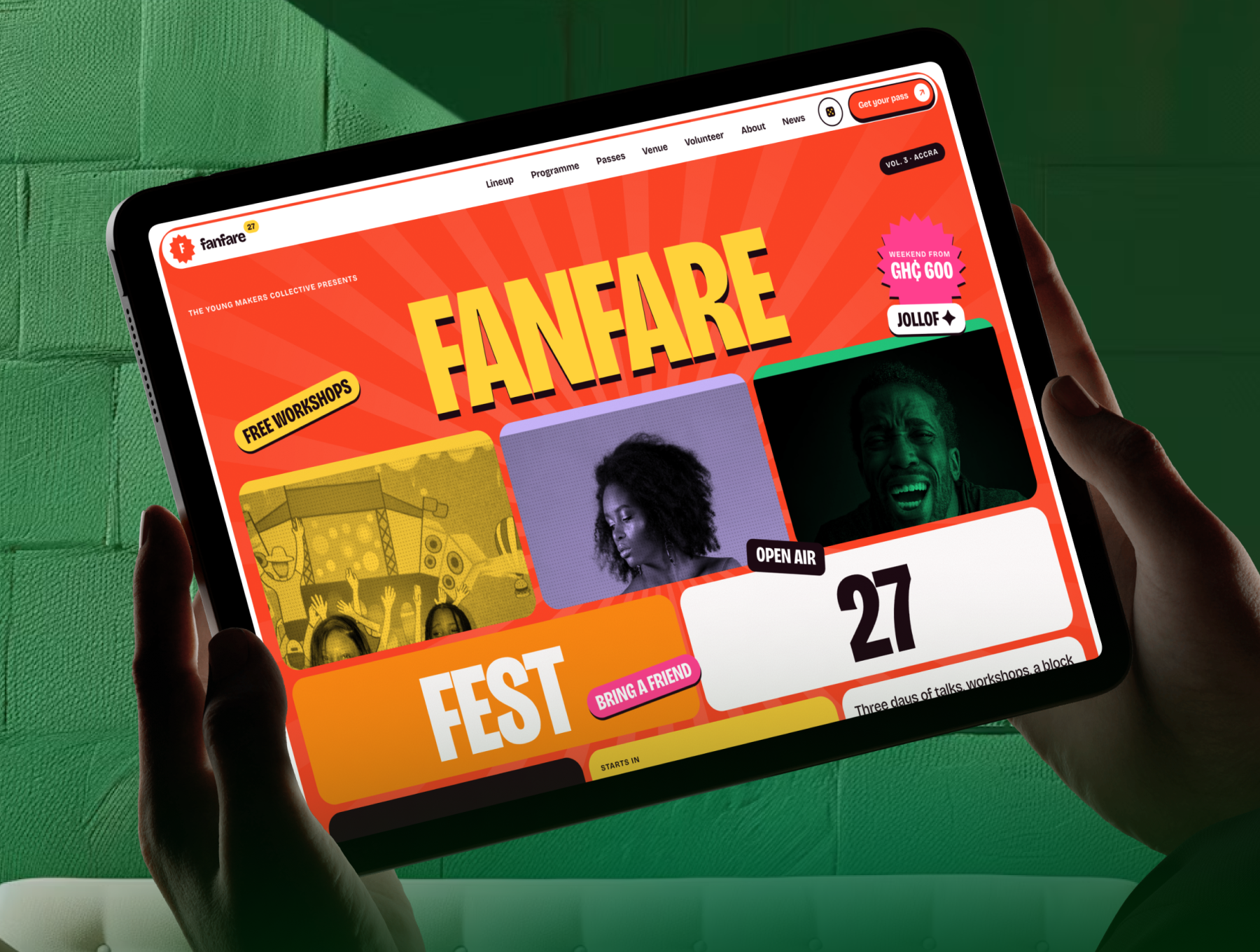 Next.js + Astro
All-Access PREMIUM NEXTJS ASTRO
Fanfare - Festival & Event Website TemplateFanfare is a colourful festival and event website template: poster hero, flip-card lineup, programme...
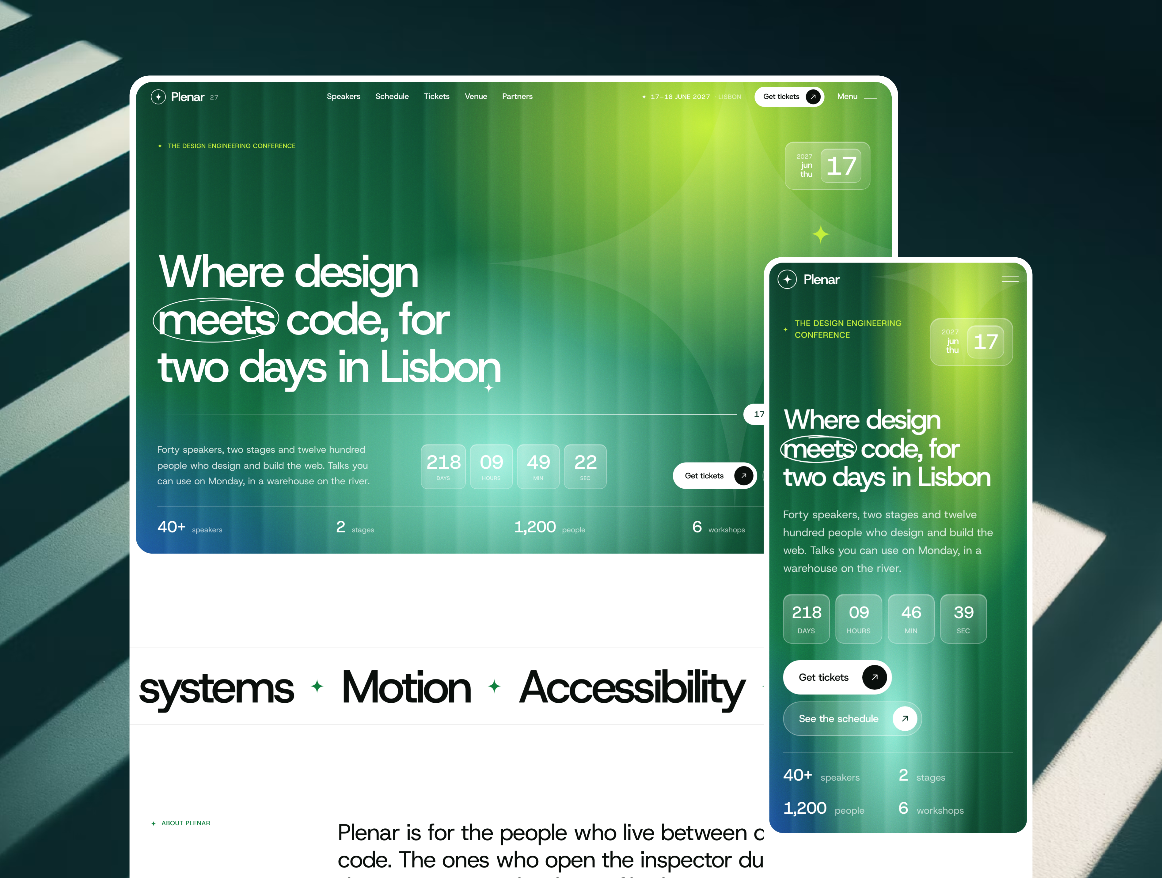 Next.js + Astro
All-Access NEXTJS ASTRO PREMIUM
Plenar - Conference & Event Website TemplatePlenar is a premium conference and event website template: countdown hero, speakers, schedule with s...
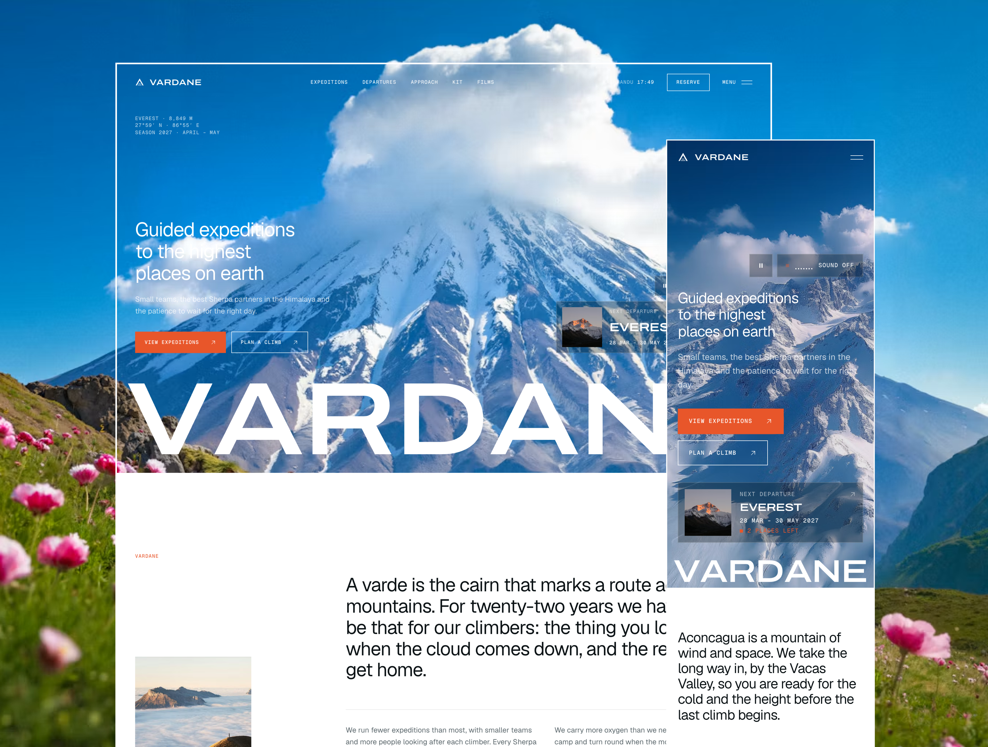 Next.js + Astro
All-Access NEXTJS ASTRO PREMIUM
Vardane - Luxury Expedition & Mountaineering Website TemplateVardane is a premium website template for mountaineering and expedition companies: film hero, route ...